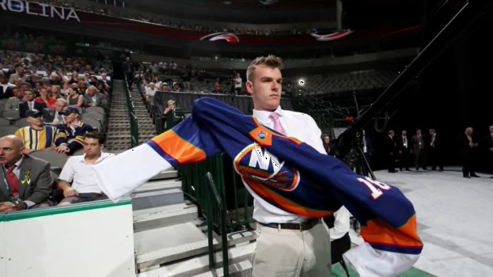
A color rush New York Islanders concept jersey was circulating online, and as with any other Islanders jersey concepts, fans had mixed reactions.
New York Islanders fans love their jersey. They like it the way it is and when a change is proposed, even if it’s a concept jersey, the reaction is usually all over the place.
On Wednesday, Eric Dunkel released his concept for a color rush concept for the final four Metropolitan Division teams, including the New York Islanders.
If you aren’t familiar with the color rush concept, the idea is to have every team play with a primary color. So instead of having white versus dark, it would be color vs. color. Thursday Night Football started it 2016 on a fulltime basis.
Dunkel starting applying the color rush concept to NHL teams in March with the Anaheim Ducks, Los Angeles Kings, San Jose Sharks, and Vancouver Canucks
.
Oilers?
This certainly wasn’t the Fisherman controversy but fans were divided in their views of the Islanders color rush concept.
Some fans loved it (that includes both myself and my co-Expert Matt O’Leary). Other fans didn’t like it one bit and some felt it was too close to the Edmonton Oilers current home jersey (which is a fair point).
Its an oilers sweater
— Oderus Urungus Fancam↙️↙️↗️ (@_burnstuff) March 18, 2020
The islander one is ?
— Nicholas ?? (@nick72888) March 18, 2020
No, maybe, NO!!!! And nah.
— Charlie (@TheRealMessing) March 18, 2020
Look, Islanders fans have a less-than-positive history when it comes to changes to the team’s jersey. The rebrand from the NY crest that was almost unchanged from the inception of the franchise in 1972 to the Fisherman logo in 1995 still haunts much of the fanbase.
The change was sudden and it was a wild departure from what fans were used to. There was no adaptation period, there was no gradual change towards this new re-brand. One day the NY crest was there and the next day waves and a fisherman starring at us. It was a shock.
Want your voice heard? Join the Eyes On Isles team!
While some members of the Isles fanbase wouldn’t mind seeing a return of the Fisherman (myself included) most of the fanbase want’s to just forget about it. I get it.
But that apprehension sometimes comes out when a new concept is introduced, even when the Fisherman isn’t part of it.
At the time of writing, our Twitter post asking for thoughts on the jersey had 20 likes and the Facebook post had 97 likes. So it seems that Isles fanbase might just be OK with this one.
