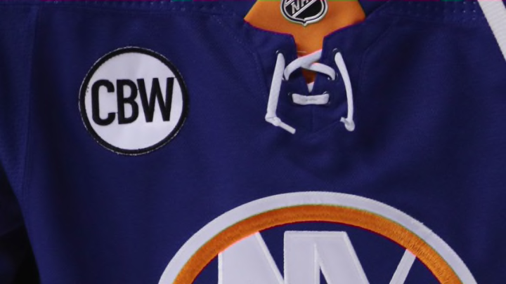
The New York Islanders have revealed some aspects of their reverse retro jerseys, and fans aren’t necessarily too impressed.
We know that all 31 NHL teams will have a reverse retro jersey for the 20-21 campaign. Adidas and all 31 teams have begun teasing these new jerseys this week. On Friday, the New York Islanders and the rest of the Metropolitan Division teased a few pictures of their jerseys.
Isles fans seem to be underwhelmed with the direction the Islanders and Adidas are taking with their reverse retro jersey.
Not Exciting
On Friday, the Islanders Twitter account teased their reverse retro jersey, as well as the other teams in the Metropolitan Division, with a series of pictures. The pictures reveal the collar, sleeves, and the Adidas logo on the back just below the collar. Navy blue will be the primary color, orange will be secondary, and white as the complementary color.
These pictures lead many fans to believe that these jerseys won’t follow the adventurous theme most of the other teams in the league are following. Which has some fans feeling underwhelmed for these soon to be released jerseys.
https://twitter.com/nhlcizikas/status/1327295961786363905
So its going to be the same, but darker.
— Brad Schober (@bschobes4) November 13, 2020
And these fans aren’t wrong. The entire point of the Reverse Retro series was to excite the fanbase with a new and totally different jersey. It was supposed to be a nod to the past while also being exciting. Just look at every other team’s release.
The LA Kings are going back to gold and purple.
The Coyotes are reworking the Katchina jersey.
The Carolina Hurricanes are taking a Whalers look.
And the Rangers are seemingly bringing back Lady Liberty.
The Islanders are using a deeper shade of blue. Excuse me while I yawn.
Look, I know that this jersey is going to be based on the sweaters the Isles wore in their first Stanley Cup-winning season in 1980. Which, in-and-of-itself, is great. But it also seems like a wasted opportunity to get creative in this one-of-a-kind marketing scheme. Giving the fans a 1980’s replica sweater seems like something that could have easily been done at another time by the Islanders.
Want your voice heard? Join the Eyes On Isles team!
I’m old enough to remember the Fisherman debacle and how this organization has shied away from any drastic change to their jersey since. I get the apprehension of doing something different with a scared logo. I do. But playing it safe on what would be a third or fourth jersey is, again, a wasted opportunity.
Maybe I’m wrong and the team goes out and does something wild with the crest. That would be incredible. But based on what we’re seeing from these releases there’s no reason to believe this team is going to embrace creativity and that is…to be boring…a wasted opportunity.
