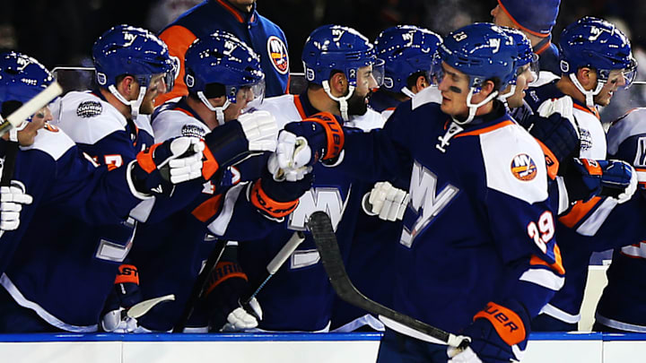
It's been ten years between Stadium Series appearances for the New York Islanders and ten years between heavily anticipated outdoor jersey designs hitting the ice and the team store shelves.
After this weekend, there will have been 82 outdoor game jerseys worn across the NHL. Some were universally lauded and ended up in a team's regular rotation, while others never saw the ice again and are rarely seen or worn at games by the fanbase. The Athletic had three of their writers rank the 10 best and 10 worst outdoor jerseys of all time, and each Islanders jersey made a list.
NHL Outdoor games are great fun for the local markets and make the league a lot of money, but their league-wide significance seems to have faded a bit.
— The Athletic (@TheAthletic) February 16, 2024
Except for the jerseys.
So our writers have ranked the 10 best outdoor jerseys — and the 10 worst ⤵️https://t.co/SoIXT5K4gr
The 2014 Islanders' Stadium Series jersey worn at Yankee Stadium featuring a chrome "NY" logo was ranked as the 4th best to ever be worn. "These jerseys are pretty solid. I like the big NY logo and mostly blue body with white shoulders and orange stripes," wrote Julie McKenzie. "They’ve since become part of the Islanders’ jersey rotation."
The team continued to wear these jerseys later in the 2013-14 season and then throughout their final season at the Nassau Coliseum. They might have had a longer on-ice run if the team hadn't moved to Brooklyn and ushered in the black-and-white third jersey concept. However, the modified large "NY" was featured on those and remains so on their current alternate jersey.
Meanwhile, the sweaters the team will wear on Sunday were ranked tied for the 2nd worst by the trio of writers. "These look like the sweater a very rich person from a very preppy boarding school wears around his or her neck for the annual club fox hunt. Only much uglier," wrote Mark Lazerus.
— New York Islanders (@NYIslanders) February 15, 2024
The immediate reactions to the team's "ISLES" sweaters (meant to evoke the Plimsoll line painted on the hull of ships) were not kind. There were four designs that were released on Jan. 26, and the Islanders' one has been by far the most criticized and ridiculed.
Whether you believe them or not, the players have said they like them since the start and were excited to break gear in on Wednesday and wear the sweater at Thursday's outdoor practice. The rest of the ensemble included a large "NY" on their dark navy helmets and orange socks.
"I already loved the jerseys when I first saw them, and today I glanced at the socks and gloves and pictured everything together. It'll look awesome out there," Casey Cizikas said. "They did a good job, and it'll be fun to wear it all together this weekend; we've been looking forward to this all year."
The thing about the design for me is that I like the concept of everything else EXCEPT the jersey. The hats, ski caps, sweaters, hoodies, etc. It all looks great. I would absolutely purchase "ISLES" themed apparel, but I wouldn't personally purchase that jersey.
I know others feel otherwise, and that's perfectly fine. Some of their opinions have changed since the release, and with expectations low, the jersey has been better received once seen on the ice. It was definitely made to support "ISLES" as a marketing angle, and the oversized largeness of everything does fit the massive venue they'll be playing in on Sunday. It's just hard to get past the huge "ISLES" across the front. You can't miss it, and that's why it's a miss for a lot of hockey fans.
