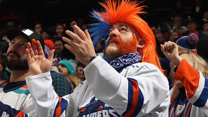
The Fisherman jersey entered the port, as in Bridgeport last night.
The New York Islanders AHL affiliate debuted their version of the updated fisherman sweater on the ice at Total Mortgage Arena on Saturday night, taking a page for their parent team who brought back the controversial logo as part of this season's Reverse Retro jerseys.
Some net differences #Isles pic.twitter.com/Olip7o8swO
— 𝐈𝐬𝐥𝐞𝐬 𝐅𝐢𝐱 (@IslesFix) February 26, 2023
The obvious difference is that these jerseys are white compared to the NHL Islanders' dark navy. The actual logo's color pattern is also different, much more closely resembling the original 1995-97 design the Islanders wore. The orange used is brighter as well. Both refreshed logos mainly stayed clear of using teal as a dominant color. The most significant difference is there is no goalie net!
There are some other cool details. "Bridgeport" is written on the inside color, and a faded Bridgeport Islanders logo can be found throughout the orange stripes toward the bottom of the sweater.
in just one hour, this jersey could be yours 👀 pic.twitter.com/9vDtUDqNQR
— Bridgeport Islanders (@AHLIslanders) February 25, 2023
The Bridgeport AHL affiliate changed their name to the "Islanders" ahead of the 2021-22 season after being known as the Soundtigers for 19 seasons. Perhaps this type of jersey synergy was one of the reasons for the move. When the name change happened, the corresponding logo change also had its fair share of detractors. Bridgeport went from a fierce Soundtiger to the current logo emphasizing the "B" and having some elements inspired by the Isles "NY" logo.
“There’s a lot of things to like about the new logo,” GM Chris Lamoriello said at the time of the primary logo's release. “The name is the first thing you are drawn to. The second part is how symbolic the B is, a predominant part of the logo."
"I like everything about it. The way it flows and ties in a lot of the components you have in the NYI logo, not just with the name. There’s a lot to be excited about. It’s got a very crisp presentation. It’s got some very core value to it that you see at the highest levels."
You'll never convince some fans that the Fisherman logo is acceptable, let alone cool or, dare we say, good. But for the segment of the fanbase that was pleased to have the infamous make a return this season, they are also fans of Bridgeport's third jersey design and might even prefer it over the design and jersey that the NHL team elected to choose.
