3 things fans should know about the New York Islanders logo

Nashville Predators v New York Islanders
Nashville Predators v New York Islanders / Bruce Bennett/GettyImages
2 of 4
Next

Earlier this week, news broke that the return of the infamous and ill-fated New York Islanders 'fisherman logo' would make a return on this season's Reverse Retro. And while all fans have plenty to say about the 1995 logo, there's a lot to love and appreciate about the Islanders' primary logo which has gone through only subtle changes since being unveiled at a press conference in 1972.

3 things fans should know about the New York Islanders logo

The logo was drawn by freelance graphic designer Jacob Morris Strongin

On a tight deadline, East Meadow advertising executive John Alogna hired freelance designer Jacob Morris Strongin from Syosset, L.I. who created the original version in his basement studio.

When you look at the logo, it wasn’t something that was thrown together. A fair amount of thought and design ability went into creating it—choosing how to design the “Islanders” word, the hockey stick and how to configure it so it all worked together. It wasn’t something that was haphazardly thrown together over the course of a weekend. It was done with great care and patience.
- Barry Strongin, son of Jacob Strongin

The original "NY" logo was drawn and then hand painted. If you look closely at it on this Facebook Page dedicated to Jacob Morris Strongin, you can see brush strokes throughout.
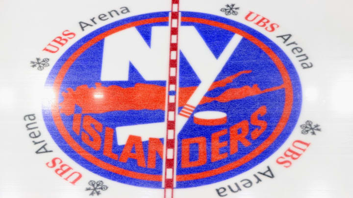
The Islanders logo teaches a geography lesson

The logo features a silhouette of Long Island, but the map stops at Nassau County and does not include Brooklyn and Queens which are part of Long Island - geographically speaking.

Toronto Maple Leafs v New York Islanders
Toronto Maple Leafs v New York Islanders / Bruce Bennett/GettyImages

The "I" in "Islanders" written across the bottom is aimed at Uniondale, the suburb in Nassau County which was home to the Islanders when they played at the Nassau Veterans Memorial Coliseum.

How three stripes became four

Steve Webb waits for the face off
Steve Webb waits for the face off / Al Bello/GettyImages

On the original logo, the "Y" hockey stick has three orange stripes on the shaft with the puck situated to the right of the stick blade. In 1998, when the team returned to a more traditional sweater they added four diagonal stripes on the right shoulder celebrating the four consecutive Stanley Cups the franchise won from 1980-83.

In 2008, the team modified this use of stripes by adding a fourth orange stripe to the shaft, once again paying homage to the Islanders dynasty.

When the team a new third jersey for the 2018-19 season, they also introduced a new "NY" crest which included a new location for the four stripes, on the stick tape.

What will happen to the four stripes if and when the Islanders win a fifth Stanley Cup?

Let's hope we soon get to find out.

Next