It's hard to please everyone.
Over the last decade, the New York Islanders have unveiled several new jersey concepts, and without fail, each has had a polarizing effect on the fanbase. Sure, any third jersey is going to sell to an extent. After all, there are plenty of hockey fans that just love owning hockey sweaters.
It can be hard to peruse the local sporting goods establishment or team store and resist buying the latest Islanders jersey if you have all the others. It can be addictive; we get it! And for every fan that wouldn't be caught dead wearing one is another that kinda likes the electric orange jerseys from the mid-2000s or, dare I say, even the black ones that Thomas Vanek once wore.

Over the last decade, the team has unveiled several new jersey concepts. The Brooklyn (and Brett Yormark) inspired black and white sweaters accompanied the move to Barclays Center, followed by the return of a blue and orange alternate in 2018-19 that they still wear today. In 2021, the team played it safe with the first Reverse Retro sweater, which was an almost identical dark navy version of what they were already wearing. Then, of course, last season marked the long-awaited or dreaded return of the Fisherman logo, although with less teal.
A nod to the past. Ready for the future. #Isles pic.twitter.com/IyGCnR51l0
— New York Islanders (@NYIslanders) October 1, 2018
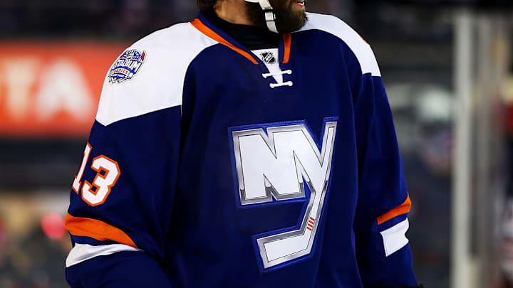
It's not easy to get this right. Alternate jersey beauty is in the eye of the beholder, but the 2014 Stadium Series sweater was and remains beloved. The first thing it had it going for it was that it wasn't black, but it was still plenty ambitious and modern. What stood out the most was the enlarged "NY" logo with the four stripes on the stick blade outlined in a chrome border.
"The logo stands out. That’s the main objective of the jersey. That’s what you want to see and that’s the most important part. It makes the jersey perfect."Casey Cizikas in 2013
The uniforms also featured diagonal stripes on the sleeves and pants with a white nameplate on the back that resembled those the Philadelphia Flyers wear. "I love the nameplates with the white on the back," said Matt Martin. "Our gloves have a little bit of white on them. It’s awesome with the chrome. The logo and the colors are bold."
The team wore them as their alternate the following season, the last at Nassau Coliseum (the first time), and although they were retired with the move to Brooklyn, the modernized "NY" logo remained the centerpiece of the black alternates and the 2018-19 alternates drew inspiration from it as well.
We get another new sweater this season as a result of the Islanders participating in the Stadium Series at MetLife Stadium against the New York Rangers in February. The curiosity around concepts is already starting. Is this the year they go back to orange as the primary color? Does the Fisherman have even more life? We'll find out the answer in a few months, but it will be hard to top the response to their first Stadium Series jersey, perhaps the best alternate they ever had.
