%20%20--%3E%0A%3Csvg%20version%3D%221.1%22%20xmlns%3D%22http%3A%2F%2Fwww.w3.org%2F2000%2Fsvg%22%20xmlns%3Axlink%3D%22http%3A%2F%2Fwww.w3.org%2F1999%2Fxlink%22%20x%3D%220px%22%20y%3D%220px%22%0A%09%20viewBox%3D%220%200%20877.5%20200%22%20style%3D%22enable-background%3Anew%200%200%20877.5%20200%3B%22%20xml%3Aspace%3D%22preserve%22%3E%0A%3Cstyle%20type%3D%22text%2Fcss%22%3E%0A%09.st0%7Bfill%3A%23231F20%3B%7D%0A%09.st1%7Bfill%3A%231C2C5B%3B%7D%0A%09.st2%7Bfill%3A%23FFFFFF%3B%7D%0A%09.st3%7Bfill%3A%23F37938%3B%7D%0A%3C%2Fstyle%3E%0A%3Cg%20id%3D%22Template%22%3E%0A%3C%2Fg%3E%0A%3Cg%20id%3D%22Layer_2%22%3E%0A%09%3Cpath%20class%3D%22st2%22%20d%3D%22M0%2C200V0h66.3v24.2H26.7V85h35.1v24.2H26.7v66.6h39.6V200H0z%22%2F%3E%0A%09%3Cpath%20class%3D%22st2%22%20d%3D%22M135.4%2C200h-26.7v-73.5L75.8%2C0h26.5l20.1%2C86.9h0.8L141.2%2C0h26.5l-32.3%2C126.5V200z%22%2F%3E%0A%09%3Cpath%20class%3D%22st2%22%20d%3D%22M183%2C200V0h66.3v24.2h-39.6V85h35.1v24.2h-35.1v66.6h39.6V200H183z%22%2F%3E%0A%09%3Cpath%20class%3D%22st2%22%20d%3D%22M319.8%2C53.8V36.2c0-8-3.9-12-11.7-12h-4.2c-7.6%2C0-11.4%2C4-11.4%2C12v33.1c0%2C3.7%2C0.7%2C6.2%2C2.2%2C7.5%0A%09%09c1.5%2C1.3%2C3.9%2C3%2C7.2%2C5l25.3%2C13.6c5.6%2C3.2%2C9.5%2C5.6%2C11.8%2C7.4c2.3%2C1.8%2C4.1%2C3.9%2C5.4%2C6.4c1.3%2C2.5%2C1.9%2C7.3%2C1.9%2C14.3v42.6%0A%09%09c0%2C22.5-10.8%2C33.7-32.3%2C33.7h-16.4c-21.4%2C0-32-12.3-32-36.8v-10h26.7v10.9c0%2C7.8%2C4%2C11.7%2C12%2C11.7h4.7c7.1%2C0%2C10.6-3.9%2C10.6-11.7v-34%0A%09%09c0-3.7-0.7-6.2-2.2-7.5c-1.5-1.3-3.9-3-7.2-5L285%2C103.3c-5.6-3-9.6-5.5-12.1-7.5c-2.5-2-4.3-4.7-5.4-7.9c-1.1-3.2-1.7-7.5-1.7-12.7%0A%09%09V34.3c0-22.8%2C10.7-34.3%2C32-34.3h16.7c21.4%2C0%2C32%2C11.4%2C32%2C34.3v19.5H319.8z%22%2F%3E%0A%09%3Cpath%20class%3D%22st2%22%20d%3D%22M380.1%2C153.1c-11.4%2C0-17.1-6-17.1-18V65.1c0-12.1%2C5.7-18.2%2C17-18.2h13.6c11.3%2C0%2C17%2C6.1%2C17%2C18.2V135%0A%09%09c0%2C12-5.7%2C18-17.1%2C18H380.1z%20M383.5%2C140.2h7.2c3.7%2C0%2C5.6-2.1%2C5.6-6.2V66c0-4.1-2.1-6.2-6.4-6.2h-6.7c-4.1%2C0-6.2%2C2.1-6.2%2C6.2v68%0A%09%09C377.1%2C138.1%2C379.2%2C140.2%2C383.5%2C140.2z%22%2F%3E%0A%09%3Cpath%20class%3D%22st2%22%20d%3D%22M452.5%2C98.2V46.9h14.2v106.1h-14.2v-21.1l-15.2-48.3v69.5h-14.2V46.9h14.2L452.5%2C98.2z%22%2F%3E%0A%09%3Cpath%20class%3D%22st2%22%20d%3D%22M483.1%2C200V0h26.7v200H483.1z%22%2F%3E%0A%09%3Cpath%20class%3D%22st2%22%20d%3D%22M586.2%2C53.8V36.2c0-8-3.9-12-11.7-12h-4.2c-7.6%2C0-11.4%2C4-11.4%2C12v33.1c0%2C3.7%2C0.7%2C6.2%2C2.2%2C7.5%0A%09%09c1.5%2C1.3%2C3.9%2C3%2C7.2%2C5l25.3%2C13.6c5.6%2C3.2%2C9.5%2C5.6%2C11.8%2C7.4c2.3%2C1.8%2C4.1%2C3.9%2C5.4%2C6.4c1.3%2C2.5%2C1.9%2C7.3%2C1.9%2C14.3v42.6%0A%09%09c0%2C22.5-10.8%2C33.7-32.3%2C33.7h-16.4c-21.4%2C0-32-12.3-32-36.8v-10h26.7v10.9c0%2C7.8%2C4%2C11.7%2C12%2C11.7h4.7c7.1%2C0%2C10.6-3.9%2C10.6-11.7v-34%0A%09%09c0-3.7-0.7-6.2-2.2-7.5c-1.5-1.3-3.9-3-7.2-5l-25.3-14.2c-5.6-3-9.6-5.5-12.1-7.5c-2.5-2-4.3-4.7-5.4-7.9%0A%09%09c-1.1-3.2-1.7-7.5-1.7-12.7V34.3c0-22.8%2C10.7-34.3%2C32-34.3h16.7c21.4%2C0%2C32%2C11.4%2C32%2C34.3v19.5H586.2z%22%2F%3E%0A%09%3Cpath%20class%3D%22st2%22%20d%3D%22M698.7%2C200h-63.5V0h26.7v175.8h36.8V200z%22%2F%3E%0A%09%3Cpath%20class%3D%22st2%22%20d%3D%22M714%2C200V0h66.3v24.2h-39.6V85h35.1v24.2h-35.1v66.6h39.6V200H714z%22%2F%3E%0A%09%3Cpath%20class%3D%22st2%22%20d%3D%22M850.8%2C53.8V36.2c0-8-3.9-12-11.7-12h-4.2c-7.6%2C0-11.4%2C4-11.4%2C12v33.1c0%2C3.7%2C0.7%2C6.2%2C2.2%2C7.5%0A%09%09c1.5%2C1.3%2C3.9%2C3%2C7.2%2C5l25.3%2C13.6c5.6%2C3.2%2C9.5%2C5.6%2C11.8%2C7.4c2.3%2C1.8%2C4.1%2C3.9%2C5.4%2C6.4c1.3%2C2.5%2C1.9%2C7.3%2C1.9%2C14.3v42.6%0A%09%09c0%2C22.5-10.8%2C33.7-32.3%2C33.7h-16.4c-21.4%2C0-32-12.3-32-36.8v-10h26.7v10.9c0%2C7.8%2C4%2C11.7%2C12%2C11.7h4.7c7.1%2C0%2C10.6-3.9%2C10.6-11.7v-34%0A%09%09c0-3.7-0.7-6.2-2.2-7.5c-1.5-1.3-3.9-3-7.2-5L816%2C103.3c-5.6-3-9.6-5.5-12.1-7.5c-2.5-2-4.3-4.7-5.4-7.9c-1.1-3.2-1.7-7.5-1.7-12.7%0A%09%09V34.3c0-22.8%2C10.7-34.3%2C32-34.3h16.7c21.4%2C0%2C32%2C11.4%2C32%2C34.3v19.5H850.8z%22%2F%3E%0A%09%3Crect%20x%3D%22362.9%22%20y%3D%2220.2%22%20class%3D%22st3%22%20width%3D%22103.7%22%20height%3D%2214.2%22%2F%3E%0A%09%3Crect%20x%3D%22362.9%22%20y%3D%22165.6%22%20class%3D%22st3%22%20width%3D%22103.7%22%20height%3D%2214.2%22%2F%3E%0A%3C%2Fg%3E%0A%3C%2Fsvg%3E%0A)

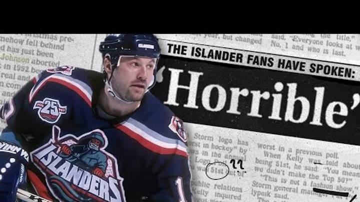
The New York Islanders’ fisherman logo is back in the spotlight, but Alan Hahn has seen enough.
When the Islanders unveiled eight finalists Tuesday for their fan-designed third jersey for the 2027-28 season, two featured the infamous fisherman crest. For Hahn, an ESPN New York radio host, MSG Network personality, former Newsday Islanders beat writer and co-author of Fishsticks, that was two too many.
“I hope it doesn’t,” Hahn told Newsday when asked about the possibility of the logo returning. “It should’ve died years ago.”
Hahn’s objection goes well beyond aesthetics. To him, the fisherman represents one of the bleakest eras in franchise history, when instability surrounding the Islanders raised legitimate concerns about their future on Long Island.
“This logo was part of an era that almost killed this franchise and almost ended up with it leaving Long Island,” Hahn said.
The fisherman debuted for the 1995-96 season and immediately became one of hockey’s most controversial redesigns. Hahn had an especially close view of its introduction as he was an Islanders intern when the original logo was unveiled.
The fisherman can not win. https://t.co/3VdYS6FF2l
— Alan Hahn (@alanhahn) August 11, 2026
“Me and another intern looked at each other going, ‘They’re not serious,’” Hahn recalled.
He also remembers the reaction inside the locker room. When the Islanders eventually returned to their traditional crest, Hahn recalled Darius Kasparaitis responding: “Good. We look like idiots.”
Nearly three decades later, nostalgia has rehabilitated the fisherman for a portion of the fan base. The Islanders even brought a variation of it back for their 2022 Reverse Retro jersey.
Hahn, however, isn’t buying the revival.
Of the eight finalists, his preference is the navy jersey featuring the standalone “NY” hockey-stick logo. “I love it because it’s classic,” Hahn said. “That NY with the hockey stick is the essence of the Islander logo.”
For Hahn, some pieces of Islanders history are worth celebrating.
The fisherman isn’t one of them.
 Add us as a preferred source on Google