%20%20--%3E%0A%3Csvg%20version%3D%221.1%22%20xmlns%3D%22http%3A%2F%2Fwww.w3.org%2F2000%2Fsvg%22%20xmlns%3Axlink%3D%22http%3A%2F%2Fwww.w3.org%2F1999%2Fxlink%22%20x%3D%220px%22%20y%3D%220px%22%0A%09%20viewBox%3D%220%200%20877.5%20200%22%20style%3D%22enable-background%3Anew%200%200%20877.5%20200%3B%22%20xml%3Aspace%3D%22preserve%22%3E%0A%3Cstyle%20type%3D%22text%2Fcss%22%3E%0A%09.st0%7Bfill%3A%23231F20%3B%7D%0A%09.st1%7Bfill%3A%231C2C5B%3B%7D%0A%09.st2%7Bfill%3A%23FFFFFF%3B%7D%0A%09.st3%7Bfill%3A%23F37938%3B%7D%0A%3C%2Fstyle%3E%0A%3Cg%20id%3D%22Template%22%3E%0A%3C%2Fg%3E%0A%3Cg%20id%3D%22Layer_2%22%3E%0A%09%3Cpath%20class%3D%22st2%22%20d%3D%22M0%2C200V0h66.3v24.2H26.7V85h35.1v24.2H26.7v66.6h39.6V200H0z%22%2F%3E%0A%09%3Cpath%20class%3D%22st2%22%20d%3D%22M135.4%2C200h-26.7v-73.5L75.8%2C0h26.5l20.1%2C86.9h0.8L141.2%2C0h26.5l-32.3%2C126.5V200z%22%2F%3E%0A%09%3Cpath%20class%3D%22st2%22%20d%3D%22M183%2C200V0h66.3v24.2h-39.6V85h35.1v24.2h-35.1v66.6h39.6V200H183z%22%2F%3E%0A%09%3Cpath%20class%3D%22st2%22%20d%3D%22M319.8%2C53.8V36.2c0-8-3.9-12-11.7-12h-4.2c-7.6%2C0-11.4%2C4-11.4%2C12v33.1c0%2C3.7%2C0.7%2C6.2%2C2.2%2C7.5%0A%09%09c1.5%2C1.3%2C3.9%2C3%2C7.2%2C5l25.3%2C13.6c5.6%2C3.2%2C9.5%2C5.6%2C11.8%2C7.4c2.3%2C1.8%2C4.1%2C3.9%2C5.4%2C6.4c1.3%2C2.5%2C1.9%2C7.3%2C1.9%2C14.3v42.6%0A%09%09c0%2C22.5-10.8%2C33.7-32.3%2C33.7h-16.4c-21.4%2C0-32-12.3-32-36.8v-10h26.7v10.9c0%2C7.8%2C4%2C11.7%2C12%2C11.7h4.7c7.1%2C0%2C10.6-3.9%2C10.6-11.7v-34%0A%09%09c0-3.7-0.7-6.2-2.2-7.5c-1.5-1.3-3.9-3-7.2-5L285%2C103.3c-5.6-3-9.6-5.5-12.1-7.5c-2.5-2-4.3-4.7-5.4-7.9c-1.1-3.2-1.7-7.5-1.7-12.7%0A%09%09V34.3c0-22.8%2C10.7-34.3%2C32-34.3h16.7c21.4%2C0%2C32%2C11.4%2C32%2C34.3v19.5H319.8z%22%2F%3E%0A%09%3Cpath%20class%3D%22st2%22%20d%3D%22M380.1%2C153.1c-11.4%2C0-17.1-6-17.1-18V65.1c0-12.1%2C5.7-18.2%2C17-18.2h13.6c11.3%2C0%2C17%2C6.1%2C17%2C18.2V135%0A%09%09c0%2C12-5.7%2C18-17.1%2C18H380.1z%20M383.5%2C140.2h7.2c3.7%2C0%2C5.6-2.1%2C5.6-6.2V66c0-4.1-2.1-6.2-6.4-6.2h-6.7c-4.1%2C0-6.2%2C2.1-6.2%2C6.2v68%0A%09%09C377.1%2C138.1%2C379.2%2C140.2%2C383.5%2C140.2z%22%2F%3E%0A%09%3Cpath%20class%3D%22st2%22%20d%3D%22M452.5%2C98.2V46.9h14.2v106.1h-14.2v-21.1l-15.2-48.3v69.5h-14.2V46.9h14.2L452.5%2C98.2z%22%2F%3E%0A%09%3Cpath%20class%3D%22st2%22%20d%3D%22M483.1%2C200V0h26.7v200H483.1z%22%2F%3E%0A%09%3Cpath%20class%3D%22st2%22%20d%3D%22M586.2%2C53.8V36.2c0-8-3.9-12-11.7-12h-4.2c-7.6%2C0-11.4%2C4-11.4%2C12v33.1c0%2C3.7%2C0.7%2C6.2%2C2.2%2C7.5%0A%09%09c1.5%2C1.3%2C3.9%2C3%2C7.2%2C5l25.3%2C13.6c5.6%2C3.2%2C9.5%2C5.6%2C11.8%2C7.4c2.3%2C1.8%2C4.1%2C3.9%2C5.4%2C6.4c1.3%2C2.5%2C1.9%2C7.3%2C1.9%2C14.3v42.6%0A%09%09c0%2C22.5-10.8%2C33.7-32.3%2C33.7h-16.4c-21.4%2C0-32-12.3-32-36.8v-10h26.7v10.9c0%2C7.8%2C4%2C11.7%2C12%2C11.7h4.7c7.1%2C0%2C10.6-3.9%2C10.6-11.7v-34%0A%09%09c0-3.7-0.7-6.2-2.2-7.5c-1.5-1.3-3.9-3-7.2-5l-25.3-14.2c-5.6-3-9.6-5.5-12.1-7.5c-2.5-2-4.3-4.7-5.4-7.9%0A%09%09c-1.1-3.2-1.7-7.5-1.7-12.7V34.3c0-22.8%2C10.7-34.3%2C32-34.3h16.7c21.4%2C0%2C32%2C11.4%2C32%2C34.3v19.5H586.2z%22%2F%3E%0A%09%3Cpath%20class%3D%22st2%22%20d%3D%22M698.7%2C200h-63.5V0h26.7v175.8h36.8V200z%22%2F%3E%0A%09%3Cpath%20class%3D%22st2%22%20d%3D%22M714%2C200V0h66.3v24.2h-39.6V85h35.1v24.2h-35.1v66.6h39.6V200H714z%22%2F%3E%0A%09%3Cpath%20class%3D%22st2%22%20d%3D%22M850.8%2C53.8V36.2c0-8-3.9-12-11.7-12h-4.2c-7.6%2C0-11.4%2C4-11.4%2C12v33.1c0%2C3.7%2C0.7%2C6.2%2C2.2%2C7.5%0A%09%09c1.5%2C1.3%2C3.9%2C3%2C7.2%2C5l25.3%2C13.6c5.6%2C3.2%2C9.5%2C5.6%2C11.8%2C7.4c2.3%2C1.8%2C4.1%2C3.9%2C5.4%2C6.4c1.3%2C2.5%2C1.9%2C7.3%2C1.9%2C14.3v42.6%0A%09%09c0%2C22.5-10.8%2C33.7-32.3%2C33.7h-16.4c-21.4%2C0-32-12.3-32-36.8v-10h26.7v10.9c0%2C7.8%2C4%2C11.7%2C12%2C11.7h4.7c7.1%2C0%2C10.6-3.9%2C10.6-11.7v-34%0A%09%09c0-3.7-0.7-6.2-2.2-7.5c-1.5-1.3-3.9-3-7.2-5L816%2C103.3c-5.6-3-9.6-5.5-12.1-7.5c-2.5-2-4.3-4.7-5.4-7.9c-1.1-3.2-1.7-7.5-1.7-12.7%0A%09%09V34.3c0-22.8%2C10.7-34.3%2C32-34.3h16.7c21.4%2C0%2C32%2C11.4%2C32%2C34.3v19.5H850.8z%22%2F%3E%0A%09%3Crect%20x%3D%22362.9%22%20y%3D%2220.2%22%20class%3D%22st3%22%20width%3D%22103.7%22%20height%3D%2214.2%22%2F%3E%0A%09%3Crect%20x%3D%22362.9%22%20y%3D%22165.6%22%20class%3D%22st3%22%20width%3D%22103.7%22%20height%3D%2214.2%22%2F%3E%0A%3C%2Fg%3E%0A%3C%2Fsvg%3E%0A)

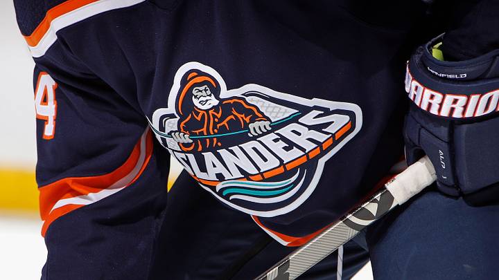
The New York Islanders Hometown Remix jerseys failed to impress.
The fanfare with which the NHL planned to introduce its latest marketing venture has hit a bit of a snag, as most fans across the league haven’t been overly encouraged by their teams’ designs.
But for the Islanders, the return of the Fisherman is a bit of a letdown, to say the least.
Back in the mid-90s, the Isles tried a rebranding of their classic logo and colors. While the move was certainly worth it at the time, the logo and the overall aesthetic didn’t stick.
To this day, Islanders fans recall the Fisherman logo with a sense of 'meh'.
Personally, that particular look wasn’t one of my favorites. But it was unique enough to really differentiate the Islanders from other logos and designs in hockey history.
And it seems that’s what the Isles are looking to recapture here. Some of the older teams, like the Toronto Maple Leafs, Boston Bruins, and Chicago Blackhawks, are looking to tap into their franchises’ heritage.
But for the Islanders, tapping a largely failed design is pretty much a bad idea. Sure, the jerseys are nice and all, but they won’t have the same appeal that a brand-new design would have brought.
Hometown Remix jerseys aren’t really all that original
One of the things that stood out to me was the relative lack of originality. In fact, you could say that there wasn’t any sort of originality at all. The 2026 Hometown Remix jerseys are essentially the same as the old 1997 jerseys.
Sure, the lines aren’t as wavy as the originals, and the colors are swapped around. But otherwise, there’s very little difference between one design and the other.
Even if other teams went a similar route, the color schemes were at least modified to a certain extent. Some clubs even went with completely revamped designs.
And that’s were the Islanders failed to capitalize on the moment.
Islanders missed an opportunity to capitalize on a era
Ultimately, the Islanders failed to encapsulate the Matthew Schaefer era. This season marked a new beginning of sorts for the franchise, with the second-year star defenseman and a brand-new captain, Bo Horvat.
That situation should have motivated the franchise to create a new design that would have reflected a rebirth of sorts.
However, the return to the Fisherman is like evoking a bygone era that wasn’t particularly special for Islanders fans.
Anyhow, the Isles will roll with their Hometown Remix jerseys on selected nights. There’s no doubt that the jerseys will sell, at least for those who can afford them, and will mark another attempt at spurring NHL marketing.
 Add us as a preferred source on Google