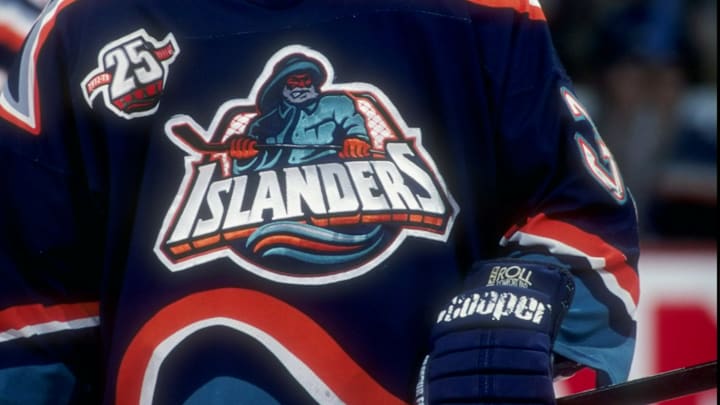
The still-controversial Fisherman jersey could be making a comeback for the New York Islanders. I know the team is already selling Fisherman-themed gear and even sells the jersey. But it's not made an on-ice appearance since it was introduced back in the late 90s.
I get why some people don't like the jersey. I respect their feelings about the jersey, its history, its design, and how it represents a lost era to them. That is a totally justified opinion. But there are others, like myself, who like the jersey and I hope my views can be respected without someone making a lame/lazy ageist argument that frankly doesn't apply.
With a possible* comeback on the way, I wanted to share some of my favorite Fisherman concepts.
*I have a hard time believing the Isles will go from a wildly boring reverse retro design in 20-21 to something this controversial two years later but anything is possible, right?
New York Islanders best fisherman concept jerseys
White background
I didn't think a white field like this would grab my eye, but man does this one just works. The four-color palette (the teal from the original is gone) makes this easier to digest I feel. And the wave isn't as wavy as it was in the original so the change-up from the normal Isles jersey is as jarring as the original fisherman would have been.
The sea was angry that day my friends. Another infamous logo retooled to the @NYIslanders current color palette for this #NHL #ReverseRetro concept. A slightly more subtle striping pattern is also pulled from elements within the logo. #Isles pic.twitter.com/vZIzJY3ciU
— Kristopher Kern (@RadKern) March 7, 2022
Perfection
I absolutely love this one. Again the wave isn't as wavy as the original. So the "ocean" gimmick doesn't smash you over the head. There's clearly a "wave" here but it's subtle. The net from behind the fisherman is gone in this jersey so again, the fisherman playing hockey gimmick isn't too on-the-nose even if he's still wielding a stick in his hands.
The field of blue matches the blue from the last reverse retro so there would be a call back here too. I really like this one. And maybe it can appeal to some who don't like the original fisherman jersey?
Isles really screwed up their reverse retro. This would have been so ? pic.twitter.com/8ilwX7wTRc
— Phil Hughes (@PJHughes45) November 19, 2020
My Man
Matt and I talked about bringing the Fisherman back a number of times in the past. When the reverse retro was first announced, Matt put out a few concepts that he came up with. This was a really solid effort by him. It doesn't change too much from the original Fisherman jersey outside of flatting out that wave. I love this one from my good friend.
Reverse Retro Concept 2:
— Matt O'Leary (@MattOLearyNY) November 13, 2020
- Fisherman!
- Modernized (no 90's waves)
- Lighthouse crest on shoulders#Isles pic.twitter.com/bgq7aWx65M
I still have a hard time believing the Isles will go from just making the jersey darker to bringing back a still highly controversial jersey in the span of two years. That would mean an absolute paradigm shift has taken place in terms of on-ice marketing and with Lou Lamoriello still President I doubt a paradigm shift is going to happen. But if somehow it does, I'd love to see one of these.
