%20%20--%3E%0A%3Csvg%20version%3D%221.1%22%20xmlns%3D%22http%3A%2F%2Fwww.w3.org%2F2000%2Fsvg%22%20xmlns%3Axlink%3D%22http%3A%2F%2Fwww.w3.org%2F1999%2Fxlink%22%20x%3D%220px%22%20y%3D%220px%22%0A%09%20viewBox%3D%220%200%20877.5%20200%22%20style%3D%22enable-background%3Anew%200%200%20877.5%20200%3B%22%20xml%3Aspace%3D%22preserve%22%3E%0A%3Cstyle%20type%3D%22text%2Fcss%22%3E%0A%09.st0%7Bfill%3A%23231F20%3B%7D%0A%09.st1%7Bfill%3A%231C2C5B%3B%7D%0A%09.st2%7Bfill%3A%23FFFFFF%3B%7D%0A%09.st3%7Bfill%3A%23F37938%3B%7D%0A%3C%2Fstyle%3E%0A%3Cg%20id%3D%22Template%22%3E%0A%3C%2Fg%3E%0A%3Cg%20id%3D%22Layer_2%22%3E%0A%09%3Cpath%20class%3D%22st2%22%20d%3D%22M0%2C200V0h66.3v24.2H26.7V85h35.1v24.2H26.7v66.6h39.6V200H0z%22%2F%3E%0A%09%3Cpath%20class%3D%22st2%22%20d%3D%22M135.4%2C200h-26.7v-73.5L75.8%2C0h26.5l20.1%2C86.9h0.8L141.2%2C0h26.5l-32.3%2C126.5V200z%22%2F%3E%0A%09%3Cpath%20class%3D%22st2%22%20d%3D%22M183%2C200V0h66.3v24.2h-39.6V85h35.1v24.2h-35.1v66.6h39.6V200H183z%22%2F%3E%0A%09%3Cpath%20class%3D%22st2%22%20d%3D%22M319.8%2C53.8V36.2c0-8-3.9-12-11.7-12h-4.2c-7.6%2C0-11.4%2C4-11.4%2C12v33.1c0%2C3.7%2C0.7%2C6.2%2C2.2%2C7.5%0A%09%09c1.5%2C1.3%2C3.9%2C3%2C7.2%2C5l25.3%2C13.6c5.6%2C3.2%2C9.5%2C5.6%2C11.8%2C7.4c2.3%2C1.8%2C4.1%2C3.9%2C5.4%2C6.4c1.3%2C2.5%2C1.9%2C7.3%2C1.9%2C14.3v42.6%0A%09%09c0%2C22.5-10.8%2C33.7-32.3%2C33.7h-16.4c-21.4%2C0-32-12.3-32-36.8v-10h26.7v10.9c0%2C7.8%2C4%2C11.7%2C12%2C11.7h4.7c7.1%2C0%2C10.6-3.9%2C10.6-11.7v-34%0A%09%09c0-3.7-0.7-6.2-2.2-7.5c-1.5-1.3-3.9-3-7.2-5L285%2C103.3c-5.6-3-9.6-5.5-12.1-7.5c-2.5-2-4.3-4.7-5.4-7.9c-1.1-3.2-1.7-7.5-1.7-12.7%0A%09%09V34.3c0-22.8%2C10.7-34.3%2C32-34.3h16.7c21.4%2C0%2C32%2C11.4%2C32%2C34.3v19.5H319.8z%22%2F%3E%0A%09%3Cpath%20class%3D%22st2%22%20d%3D%22M380.1%2C153.1c-11.4%2C0-17.1-6-17.1-18V65.1c0-12.1%2C5.7-18.2%2C17-18.2h13.6c11.3%2C0%2C17%2C6.1%2C17%2C18.2V135%0A%09%09c0%2C12-5.7%2C18-17.1%2C18H380.1z%20M383.5%2C140.2h7.2c3.7%2C0%2C5.6-2.1%2C5.6-6.2V66c0-4.1-2.1-6.2-6.4-6.2h-6.7c-4.1%2C0-6.2%2C2.1-6.2%2C6.2v68%0A%09%09C377.1%2C138.1%2C379.2%2C140.2%2C383.5%2C140.2z%22%2F%3E%0A%09%3Cpath%20class%3D%22st2%22%20d%3D%22M452.5%2C98.2V46.9h14.2v106.1h-14.2v-21.1l-15.2-48.3v69.5h-14.2V46.9h14.2L452.5%2C98.2z%22%2F%3E%0A%09%3Cpath%20class%3D%22st2%22%20d%3D%22M483.1%2C200V0h26.7v200H483.1z%22%2F%3E%0A%09%3Cpath%20class%3D%22st2%22%20d%3D%22M586.2%2C53.8V36.2c0-8-3.9-12-11.7-12h-4.2c-7.6%2C0-11.4%2C4-11.4%2C12v33.1c0%2C3.7%2C0.7%2C6.2%2C2.2%2C7.5%0A%09%09c1.5%2C1.3%2C3.9%2C3%2C7.2%2C5l25.3%2C13.6c5.6%2C3.2%2C9.5%2C5.6%2C11.8%2C7.4c2.3%2C1.8%2C4.1%2C3.9%2C5.4%2C6.4c1.3%2C2.5%2C1.9%2C7.3%2C1.9%2C14.3v42.6%0A%09%09c0%2C22.5-10.8%2C33.7-32.3%2C33.7h-16.4c-21.4%2C0-32-12.3-32-36.8v-10h26.7v10.9c0%2C7.8%2C4%2C11.7%2C12%2C11.7h4.7c7.1%2C0%2C10.6-3.9%2C10.6-11.7v-34%0A%09%09c0-3.7-0.7-6.2-2.2-7.5c-1.5-1.3-3.9-3-7.2-5l-25.3-14.2c-5.6-3-9.6-5.5-12.1-7.5c-2.5-2-4.3-4.7-5.4-7.9%0A%09%09c-1.1-3.2-1.7-7.5-1.7-12.7V34.3c0-22.8%2C10.7-34.3%2C32-34.3h16.7c21.4%2C0%2C32%2C11.4%2C32%2C34.3v19.5H586.2z%22%2F%3E%0A%09%3Cpath%20class%3D%22st2%22%20d%3D%22M698.7%2C200h-63.5V0h26.7v175.8h36.8V200z%22%2F%3E%0A%09%3Cpath%20class%3D%22st2%22%20d%3D%22M714%2C200V0h66.3v24.2h-39.6V85h35.1v24.2h-35.1v66.6h39.6V200H714z%22%2F%3E%0A%09%3Cpath%20class%3D%22st2%22%20d%3D%22M850.8%2C53.8V36.2c0-8-3.9-12-11.7-12h-4.2c-7.6%2C0-11.4%2C4-11.4%2C12v33.1c0%2C3.7%2C0.7%2C6.2%2C2.2%2C7.5%0A%09%09c1.5%2C1.3%2C3.9%2C3%2C7.2%2C5l25.3%2C13.6c5.6%2C3.2%2C9.5%2C5.6%2C11.8%2C7.4c2.3%2C1.8%2C4.1%2C3.9%2C5.4%2C6.4c1.3%2C2.5%2C1.9%2C7.3%2C1.9%2C14.3v42.6%0A%09%09c0%2C22.5-10.8%2C33.7-32.3%2C33.7h-16.4c-21.4%2C0-32-12.3-32-36.8v-10h26.7v10.9c0%2C7.8%2C4%2C11.7%2C12%2C11.7h4.7c7.1%2C0%2C10.6-3.9%2C10.6-11.7v-34%0A%09%09c0-3.7-0.7-6.2-2.2-7.5c-1.5-1.3-3.9-3-7.2-5L816%2C103.3c-5.6-3-9.6-5.5-12.1-7.5c-2.5-2-4.3-4.7-5.4-7.9c-1.1-3.2-1.7-7.5-1.7-12.7%0A%09%09V34.3c0-22.8%2C10.7-34.3%2C32-34.3h16.7c21.4%2C0%2C32%2C11.4%2C32%2C34.3v19.5H850.8z%22%2F%3E%0A%09%3Crect%20x%3D%22362.9%22%20y%3D%2220.2%22%20class%3D%22st3%22%20width%3D%22103.7%22%20height%3D%2214.2%22%2F%3E%0A%09%3Crect%20x%3D%22362.9%22%20y%3D%22165.6%22%20class%3D%22st3%22%20width%3D%22103.7%22%20height%3D%2214.2%22%2F%3E%0A%3C%2Fg%3E%0A%3C%2Fsvg%3E%0A)

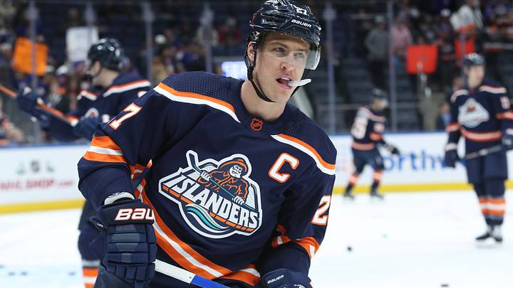
One of the most infamous logos in NHL history is the Islanders fisherman logo. Back in the mid-90s, the Islanders decided to rebrand. They rolled out a brand-new logo with a fisherman holding a hockey stick with the word Islanders underneath it. This new logo was met with immediate hate. The backlash was so bad that the Islanders only wore it for two seasons. It has gone down as one of the worst re-designs in NHL history. However, over the past few years, something has changed. Fans have begun to embrace this logo and jersey. But what caused this change?
How the "Fish Stick" logo went from hated to loved
During the 1990s, many teams underwent rebrands. The Kings, Sharks, and Ducks have all gone through rebrands to try and shake things up. These were a massive success as they were loved and sold a ton of jerseys. The Islanders saw that and wanted to get in on the action. They had fallen on hard times as the team had been struggling after the 1980s dynasty. They were also abysmal in merchandise sales, being 24th out of 26th.
So on June 22nd, 1995, the Islanders revealed their redesign to the world. Wanting to embrace the history of Long Island fishing tradition, they made it a fisherman. As mentioned before, the public reaction was immediate vitriol. Many felt that it looked too much like the Gorton Fish Stick logo, thus earning it the "Fish Stick" nickname. During games, fans would chant "we want fish sticks" at the Islanders. It was a total disaster, and the Islanders were quick to move away from it.
But over the years, the perception around the logo had changed. As younger Islanders fans got older, they began to see the logo as nostalgic. Instead of it being an embarrassment, it was a part of their childhood and the jersey of the team they fell in love with. This led to calls for the team to start wearing them again. These calls were answered in 2022, when the Islanders announced they would wear them as part of the Reverse Retro series.
The biggest sign of the change in the perception around the "Fish Stick" logo was when the Bridgeport Islanders adopted it as their primary logo. For years, the Islanders' AHL affiliate did not have a big connection to the club. That is why they rebranded from Sound Tigers to Islanders. In order to build a stronger bond with Islanders fans, they modernized the "fish stick" logo and put it in the middle of their jersey. Thus, changing the legacy of that logo.
Although it started out as a disaster, the "fish stick" logo has engraved itself as part of Islanders lore. It is a unique part of the franchise's history that will continue to grow in popularity as the years go on.
 Add us as a preferred source on Google