%20%20--%3E%0A%3Csvg%20version%3D%221.1%22%20xmlns%3D%22http%3A%2F%2Fwww.w3.org%2F2000%2Fsvg%22%20xmlns%3Axlink%3D%22http%3A%2F%2Fwww.w3.org%2F1999%2Fxlink%22%20x%3D%220px%22%20y%3D%220px%22%0A%09%20viewBox%3D%220%200%20877.5%20200%22%20style%3D%22enable-background%3Anew%200%200%20877.5%20200%3B%22%20xml%3Aspace%3D%22preserve%22%3E%0A%3Cstyle%20type%3D%22text%2Fcss%22%3E%0A%09.st0%7Bfill%3A%23231F20%3B%7D%0A%09.st1%7Bfill%3A%231C2C5B%3B%7D%0A%09.st2%7Bfill%3A%23FFFFFF%3B%7D%0A%09.st3%7Bfill%3A%23F37938%3B%7D%0A%3C%2Fstyle%3E%0A%3Cg%20id%3D%22Template%22%3E%0A%3C%2Fg%3E%0A%3Cg%20id%3D%22Layer_2%22%3E%0A%09%3Cpath%20class%3D%22st2%22%20d%3D%22M0%2C200V0h66.3v24.2H26.7V85h35.1v24.2H26.7v66.6h39.6V200H0z%22%2F%3E%0A%09%3Cpath%20class%3D%22st2%22%20d%3D%22M135.4%2C200h-26.7v-73.5L75.8%2C0h26.5l20.1%2C86.9h0.8L141.2%2C0h26.5l-32.3%2C126.5V200z%22%2F%3E%0A%09%3Cpath%20class%3D%22st2%22%20d%3D%22M183%2C200V0h66.3v24.2h-39.6V85h35.1v24.2h-35.1v66.6h39.6V200H183z%22%2F%3E%0A%09%3Cpath%20class%3D%22st2%22%20d%3D%22M319.8%2C53.8V36.2c0-8-3.9-12-11.7-12h-4.2c-7.6%2C0-11.4%2C4-11.4%2C12v33.1c0%2C3.7%2C0.7%2C6.2%2C2.2%2C7.5%0A%09%09c1.5%2C1.3%2C3.9%2C3%2C7.2%2C5l25.3%2C13.6c5.6%2C3.2%2C9.5%2C5.6%2C11.8%2C7.4c2.3%2C1.8%2C4.1%2C3.9%2C5.4%2C6.4c1.3%2C2.5%2C1.9%2C7.3%2C1.9%2C14.3v42.6%0A%09%09c0%2C22.5-10.8%2C33.7-32.3%2C33.7h-16.4c-21.4%2C0-32-12.3-32-36.8v-10h26.7v10.9c0%2C7.8%2C4%2C11.7%2C12%2C11.7h4.7c7.1%2C0%2C10.6-3.9%2C10.6-11.7v-34%0A%09%09c0-3.7-0.7-6.2-2.2-7.5c-1.5-1.3-3.9-3-7.2-5L285%2C103.3c-5.6-3-9.6-5.5-12.1-7.5c-2.5-2-4.3-4.7-5.4-7.9c-1.1-3.2-1.7-7.5-1.7-12.7%0A%09%09V34.3c0-22.8%2C10.7-34.3%2C32-34.3h16.7c21.4%2C0%2C32%2C11.4%2C32%2C34.3v19.5H319.8z%22%2F%3E%0A%09%3Cpath%20class%3D%22st2%22%20d%3D%22M380.1%2C153.1c-11.4%2C0-17.1-6-17.1-18V65.1c0-12.1%2C5.7-18.2%2C17-18.2h13.6c11.3%2C0%2C17%2C6.1%2C17%2C18.2V135%0A%09%09c0%2C12-5.7%2C18-17.1%2C18H380.1z%20M383.5%2C140.2h7.2c3.7%2C0%2C5.6-2.1%2C5.6-6.2V66c0-4.1-2.1-6.2-6.4-6.2h-6.7c-4.1%2C0-6.2%2C2.1-6.2%2C6.2v68%0A%09%09C377.1%2C138.1%2C379.2%2C140.2%2C383.5%2C140.2z%22%2F%3E%0A%09%3Cpath%20class%3D%22st2%22%20d%3D%22M452.5%2C98.2V46.9h14.2v106.1h-14.2v-21.1l-15.2-48.3v69.5h-14.2V46.9h14.2L452.5%2C98.2z%22%2F%3E%0A%09%3Cpath%20class%3D%22st2%22%20d%3D%22M483.1%2C200V0h26.7v200H483.1z%22%2F%3E%0A%09%3Cpath%20class%3D%22st2%22%20d%3D%22M586.2%2C53.8V36.2c0-8-3.9-12-11.7-12h-4.2c-7.6%2C0-11.4%2C4-11.4%2C12v33.1c0%2C3.7%2C0.7%2C6.2%2C2.2%2C7.5%0A%09%09c1.5%2C1.3%2C3.9%2C3%2C7.2%2C5l25.3%2C13.6c5.6%2C3.2%2C9.5%2C5.6%2C11.8%2C7.4c2.3%2C1.8%2C4.1%2C3.9%2C5.4%2C6.4c1.3%2C2.5%2C1.9%2C7.3%2C1.9%2C14.3v42.6%0A%09%09c0%2C22.5-10.8%2C33.7-32.3%2C33.7h-16.4c-21.4%2C0-32-12.3-32-36.8v-10h26.7v10.9c0%2C7.8%2C4%2C11.7%2C12%2C11.7h4.7c7.1%2C0%2C10.6-3.9%2C10.6-11.7v-34%0A%09%09c0-3.7-0.7-6.2-2.2-7.5c-1.5-1.3-3.9-3-7.2-5l-25.3-14.2c-5.6-3-9.6-5.5-12.1-7.5c-2.5-2-4.3-4.7-5.4-7.9%0A%09%09c-1.1-3.2-1.7-7.5-1.7-12.7V34.3c0-22.8%2C10.7-34.3%2C32-34.3h16.7c21.4%2C0%2C32%2C11.4%2C32%2C34.3v19.5H586.2z%22%2F%3E%0A%09%3Cpath%20class%3D%22st2%22%20d%3D%22M698.7%2C200h-63.5V0h26.7v175.8h36.8V200z%22%2F%3E%0A%09%3Cpath%20class%3D%22st2%22%20d%3D%22M714%2C200V0h66.3v24.2h-39.6V85h35.1v24.2h-35.1v66.6h39.6V200H714z%22%2F%3E%0A%09%3Cpath%20class%3D%22st2%22%20d%3D%22M850.8%2C53.8V36.2c0-8-3.9-12-11.7-12h-4.2c-7.6%2C0-11.4%2C4-11.4%2C12v33.1c0%2C3.7%2C0.7%2C6.2%2C2.2%2C7.5%0A%09%09c1.5%2C1.3%2C3.9%2C3%2C7.2%2C5l25.3%2C13.6c5.6%2C3.2%2C9.5%2C5.6%2C11.8%2C7.4c2.3%2C1.8%2C4.1%2C3.9%2C5.4%2C6.4c1.3%2C2.5%2C1.9%2C7.3%2C1.9%2C14.3v42.6%0A%09%09c0%2C22.5-10.8%2C33.7-32.3%2C33.7h-16.4c-21.4%2C0-32-12.3-32-36.8v-10h26.7v10.9c0%2C7.8%2C4%2C11.7%2C12%2C11.7h4.7c7.1%2C0%2C10.6-3.9%2C10.6-11.7v-34%0A%09%09c0-3.7-0.7-6.2-2.2-7.5c-1.5-1.3-3.9-3-7.2-5L816%2C103.3c-5.6-3-9.6-5.5-12.1-7.5c-2.5-2-4.3-4.7-5.4-7.9c-1.1-3.2-1.7-7.5-1.7-12.7%0A%09%09V34.3c0-22.8%2C10.7-34.3%2C32-34.3h16.7c21.4%2C0%2C32%2C11.4%2C32%2C34.3v19.5H850.8z%22%2F%3E%0A%09%3Crect%20x%3D%22362.9%22%20y%3D%2220.2%22%20class%3D%22st3%22%20width%3D%22103.7%22%20height%3D%2214.2%22%2F%3E%0A%09%3Crect%20x%3D%22362.9%22%20y%3D%22165.6%22%20class%3D%22st3%22%20width%3D%22103.7%22%20height%3D%2214.2%22%2F%3E%0A%3C%2Fg%3E%0A%3C%2Fsvg%3E%0A)

The Lighthouse is back.
The New York Islanders have a long history with the Lighthouse logo, including having it as the secondary logo during the infamous fisherman logo years. Now, after a fan poll, the Lighthouse is back. It will be the team's new third jersey logo.
DRUMROLL PLEASE 🥁🥁🥁
— New York Islanders (@NYIslanders) August 20, 2026
The winning Third Jersey Design Concept is the Navy Lighthouse!
Stay tuned for the final kit design. pic.twitter.com/WE5PdM4QWZ
Perfectly timed for our theme week of Best and Worst, let's look at how the lighthouse logo stacks up against the other Islanders' logos throughout history.
The options
The primary logo

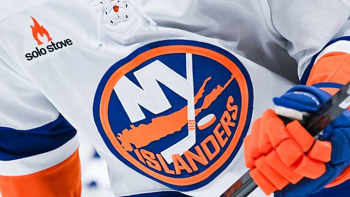
With the exception of a controversial other primary logo, the Islanders have used a variety of options centered around the primary logo. Since the inaugural season, the Islanders have had variations on this logo, really only changing the colors and borders slightly. In 2010, the logo was updated to include four lines on the stick instead of three, representing the four consecutive Stanley Cups the team won in the 1980s.
The Fisherman logo
The New York Islanders' angry fisherman jerseys will make a triumphant return in February. http://t.co/pcqtsfOwnd pic.twitter.com/cHOvbmLxhc
— Sportsnet (@Sportsnet) January 9, 2015
In 1995, the Islanders changed everything up and switched to a primary logo that featured a fisherman. It did not go well. Fans and players alike did not like the logo, and the league ended up caving and going back to the old primary logo.
Alternative logos
From 1995-1997, the Islanders had an alternate lighthouse logo, much like the new one the team will use as their third jersey. The team also used an alternate logo on the Stadium Series jerseys in 2014. It featured the NY and hockey stick from the primary logo, without the island background. This has been used on other jerseys in the past, but never as a primary logo.
The Lighthouse logo of 2026
There is ONE hour left. Voting ends exactly at 5PM.
— New York Islanders (@NYIslanders) August 20, 2026
Get your vote in NOW ⬇️
The new lighthouse jersey features a lighthouse logo nearly identical to the original one, on a dark navy jersey, with orange and teal bands on the arms and the bottom of the jersey.
The Ranking
#1: The Fisherman
Yes, this is an unpopular opinion. Sorry, Islanders fans! The Fisherman may be one of the most hated logos in NHL history, but I think it does the best at summing up what an Islander is. It's hard to get a feeling for what the Islanders are from the primary logo. I also really like the color scheme of the Fisherman jersey, and I think the Fisherman logo is far more foreboding and intimidating to a team than a circle with an island in it.
#2: The Primary Logo
Though it was once described as the worst logo in the NHL, I think it does its job. It represents hockey and Long Island, and the colors aren't the worst. It's incredibly recognizable in NHL history, especially because the team has rarely deviated from this logo.
I do prefer the alternative logo that they have used in the past, of just the NY and the hockey stick; it's simpler and cleaner. The addition of the four lines on the stick to represent the four-peat is a nice touch.
#3: The Lighthouse
While I prefer the Lighthouse to the other option for the fan vote, the biggest issue for me is that it doesn't say Islanders anywhere on the jersey. Sure, a logo doesn't need to have the team name, but seeing as both other logos give some mention of the Islanders, either with an NY or with the team name, it feels like it's missing something.
Aside from that, the color scheme is great, and it will fit in well with the rest of the Islanders' history, especially with the nod to the original Lighthouse alternate logo.
 Add us as a preferred source on Google